- Client
- Seeds of the Soil
- Services
- Logo designBrand Identity DesignBrand Guidelines
This land is now ours
Let’s face it. Many Africans are undereducated about their history and heritage. This has led to a gap in self awareness and understanding of their potential. As a result, they often live below their full capacity, leading to ongoing struggles in politics, business and overall well-being.
Seeds of the Soil (SOS) is an organization that was created to re-educate the African man through the creation of content that educates, entertains and inspires.
The Logo
In a series of discovery meetings with the SOS team, we uncovered an insight that served as a foundation for the logo system. Long before western civilization, a group called the ‘Ekoi’ in Africa developed a system of ideographic writings called “Nsibidi”
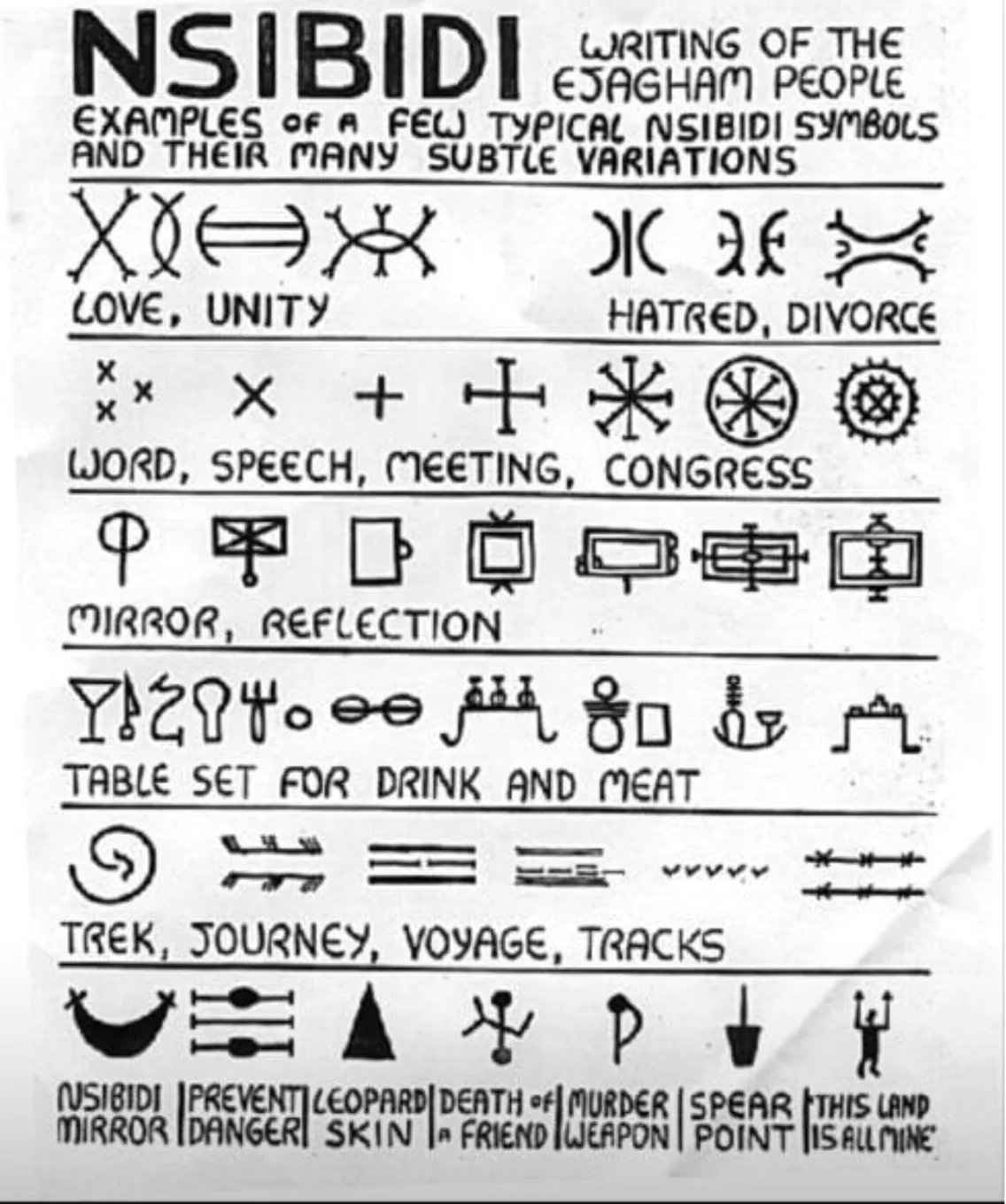
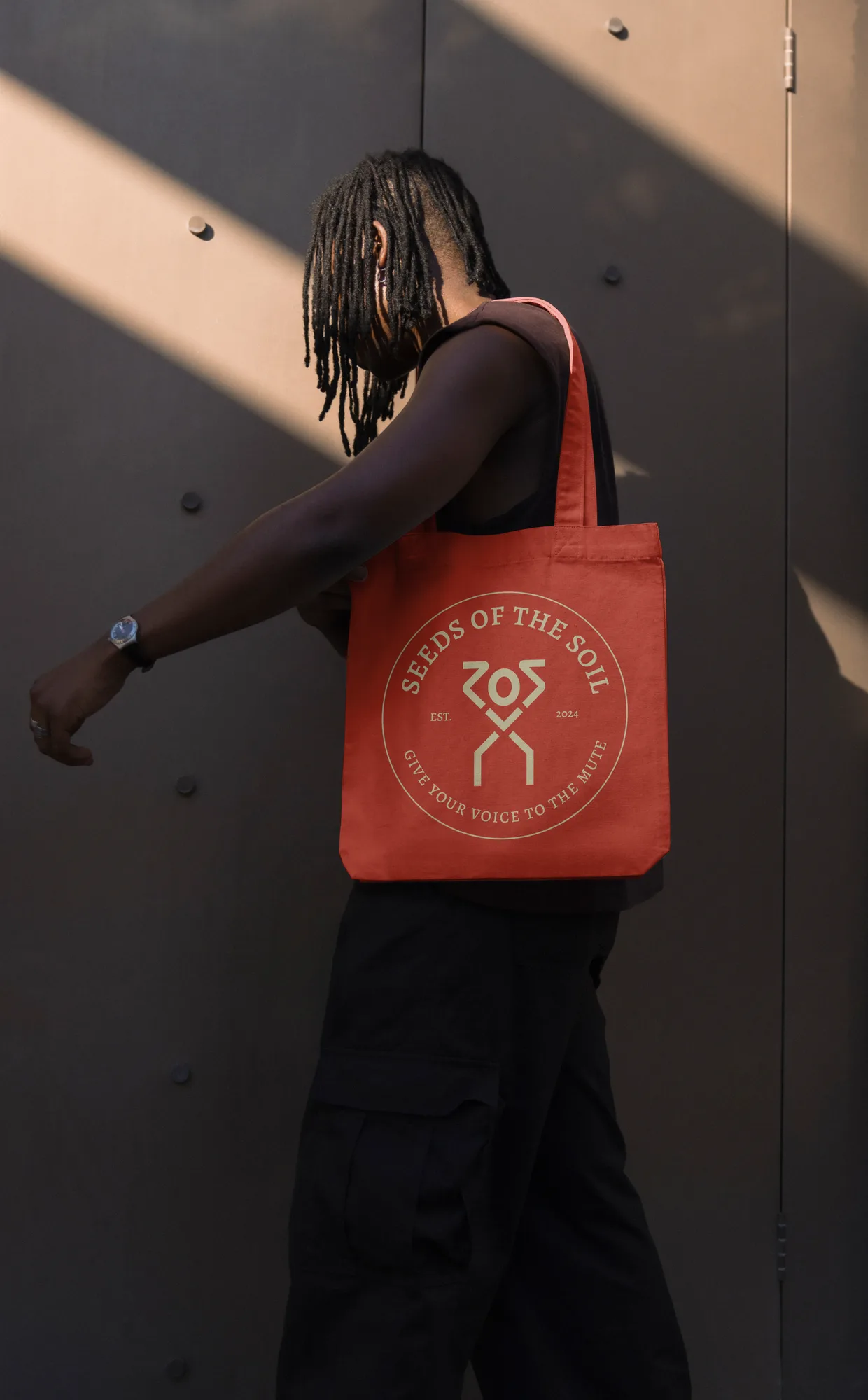
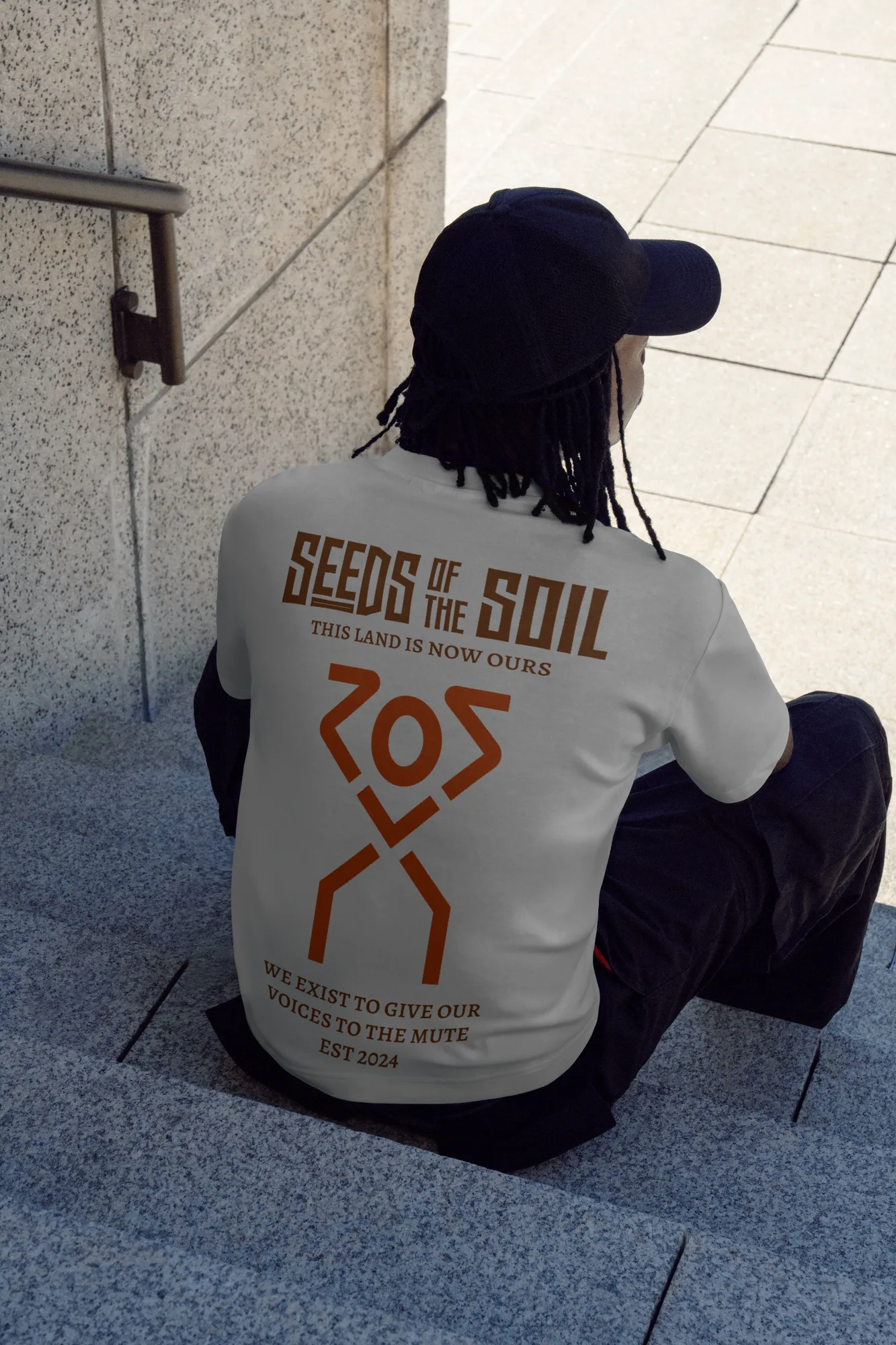
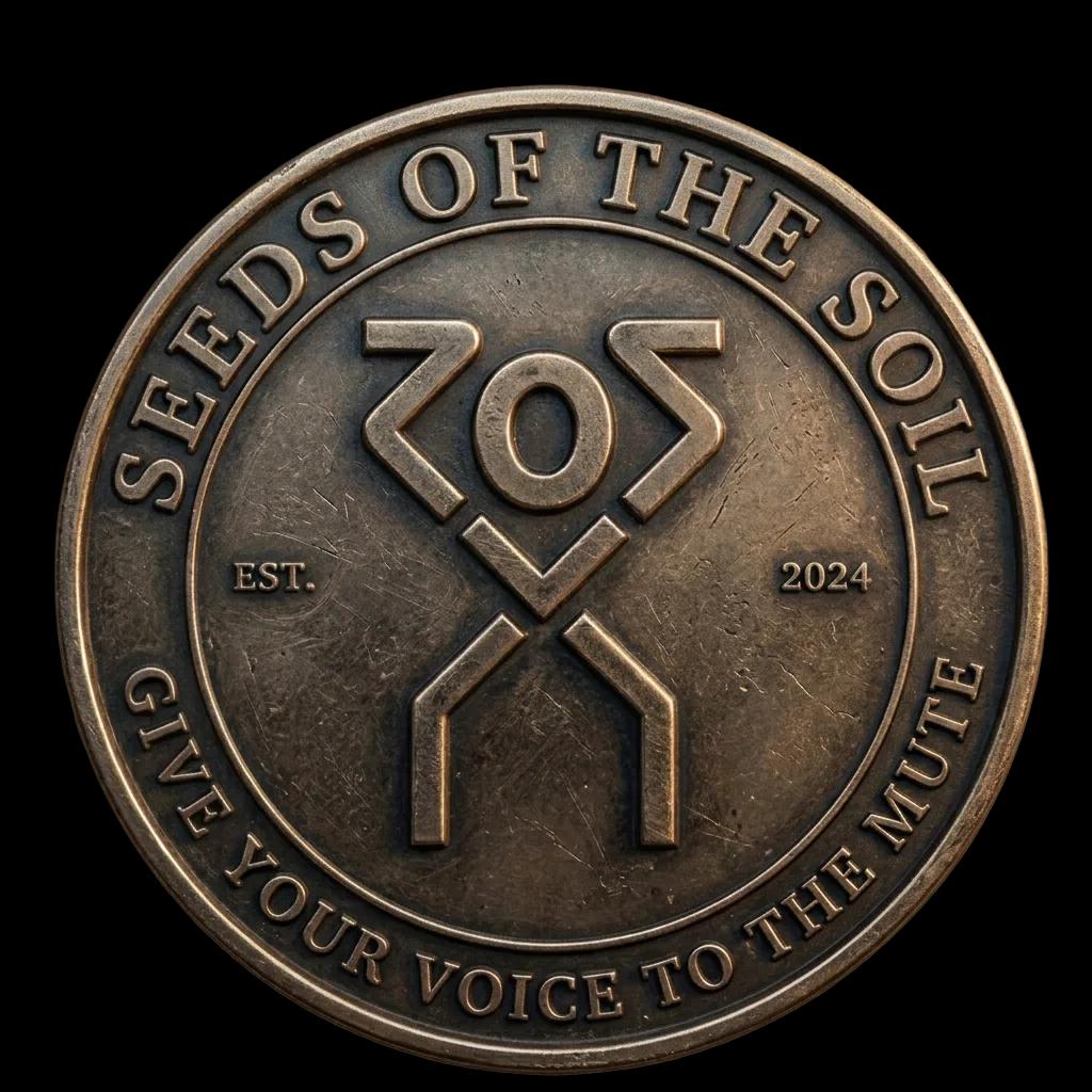
We used this as a launching point for creating the SOS symbol. The representation, in particular, for ‘this land is now ours,’ a subtle nod to the fact that SOS was helping the African man reclaim his heritage, was of particular influence on the SOS symbol.

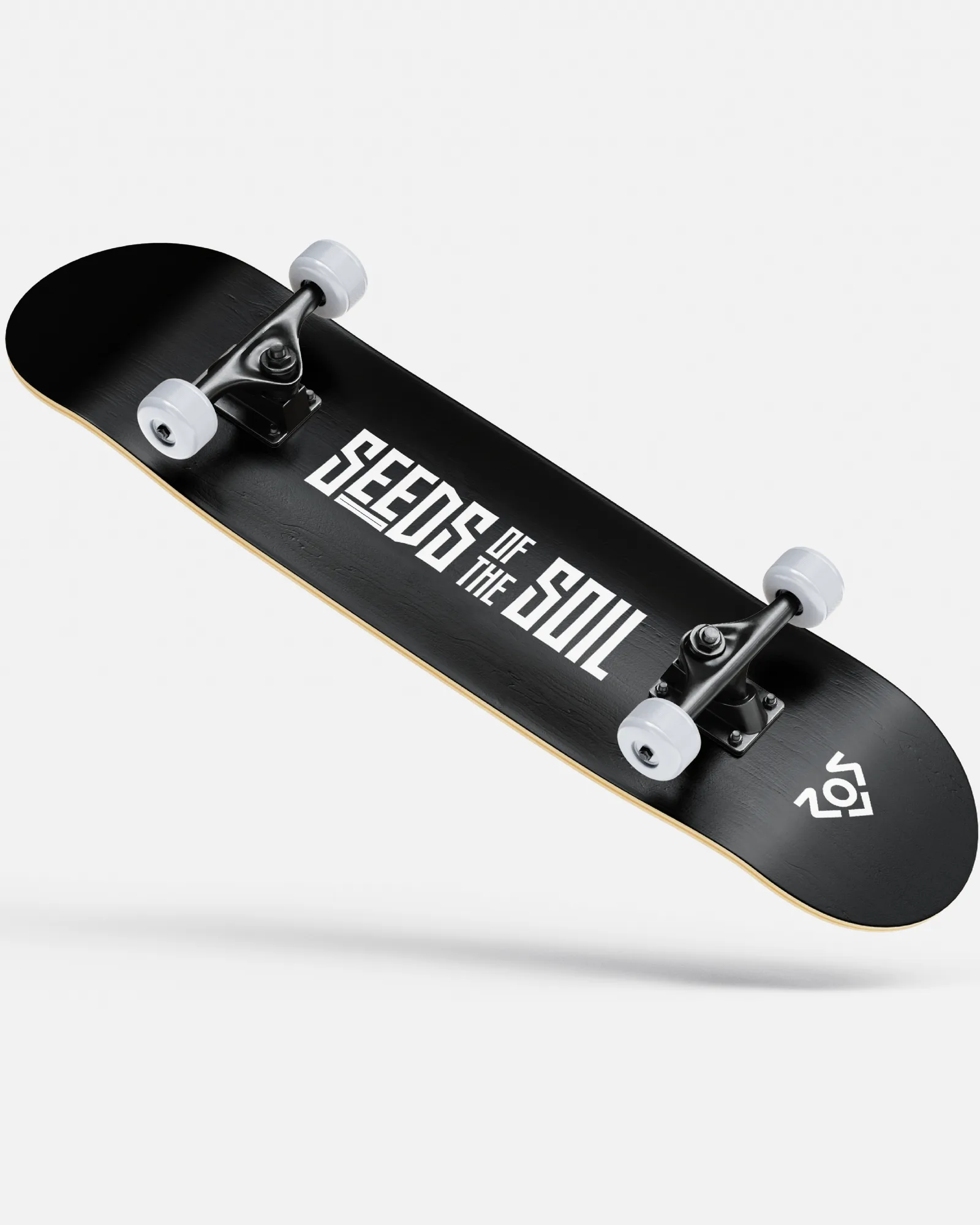
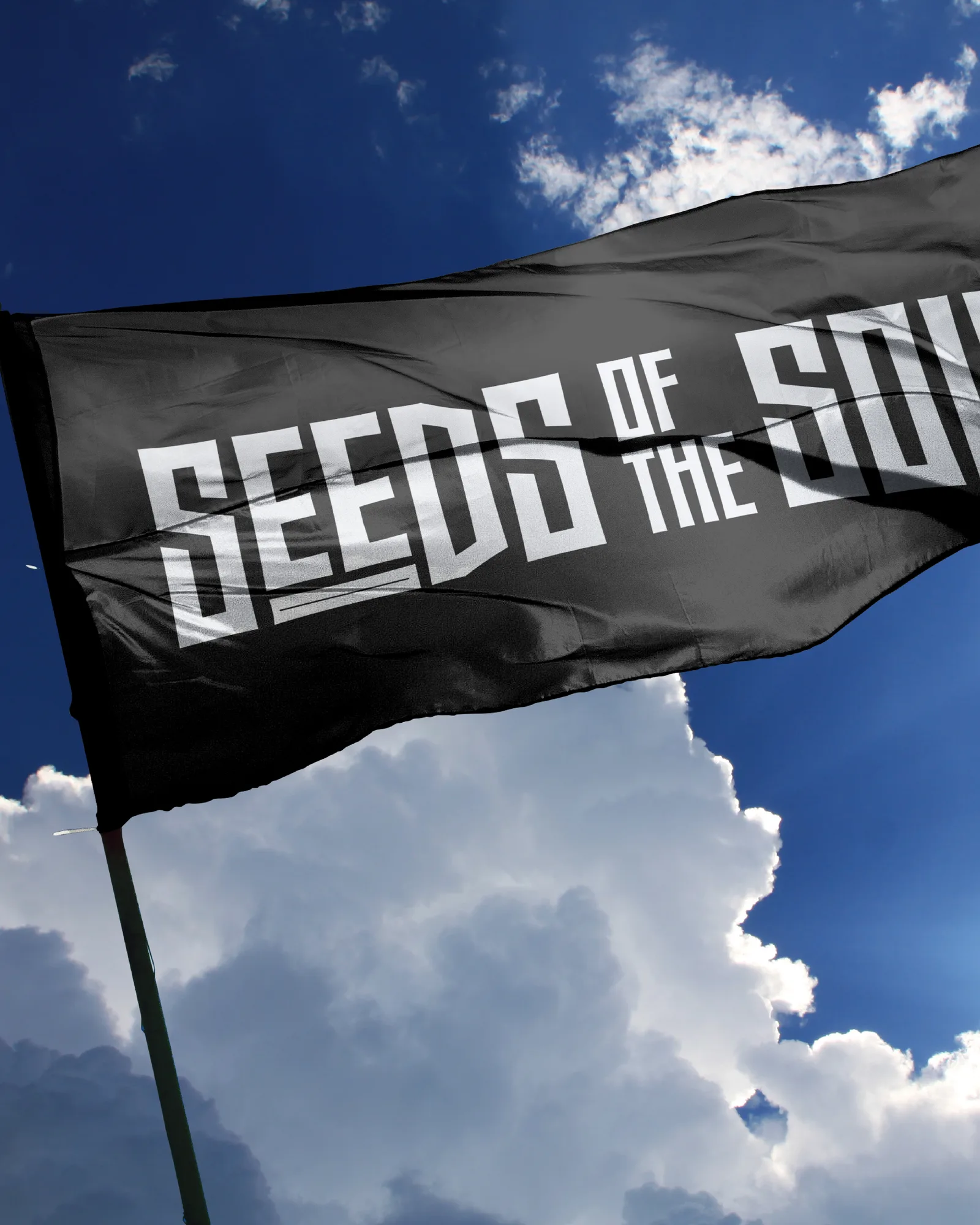
The Wordmark
After the symbol was done, we dove into the wordmark. We had two goals with the word mark:
For it to ‘feel’ African and give off elements of culture without looking cliché.
For it to have a compact lockup that could shrink and scale, since the brand name was a mouthful.
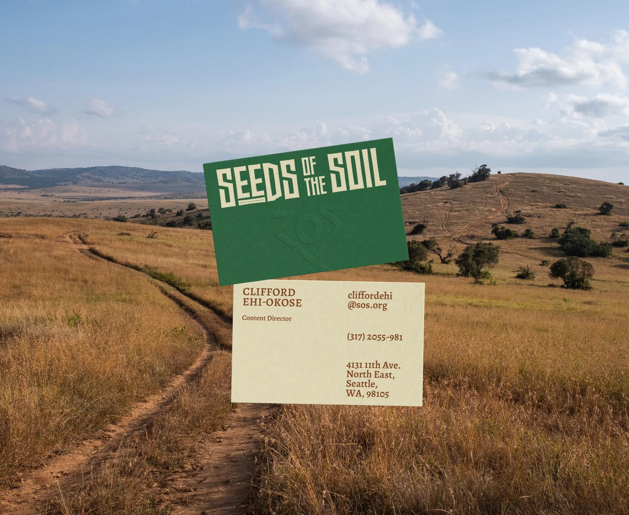
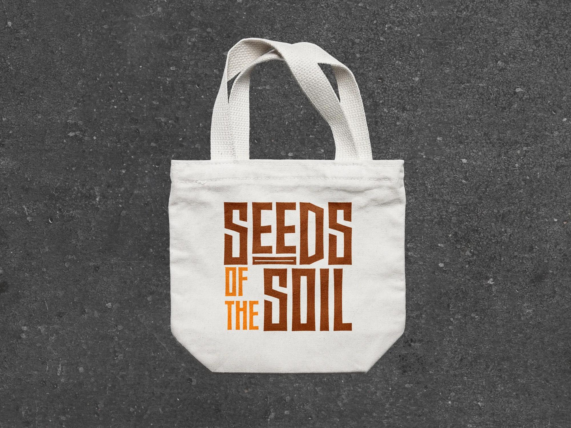
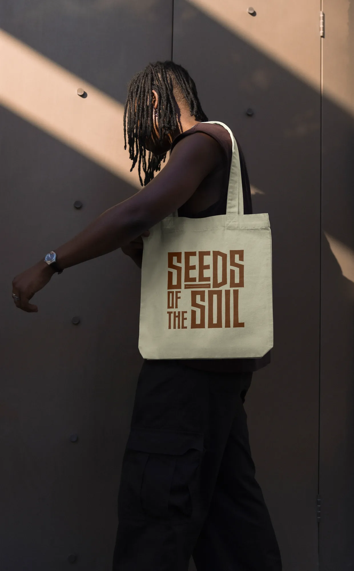
The wordmark was inspired by the ‘Makalo Typeface’. which was a typeface that had a great balance between past culture and forward thinking. From there, we worked on multiple lockup variations until we came to two that felt good enough (because perfection is a myth). One was a stacked lockup to work in the tiny spaces, and the other was a horizontal lockup, to be used where the stacked lockup just won’t do it
Typography & Layout
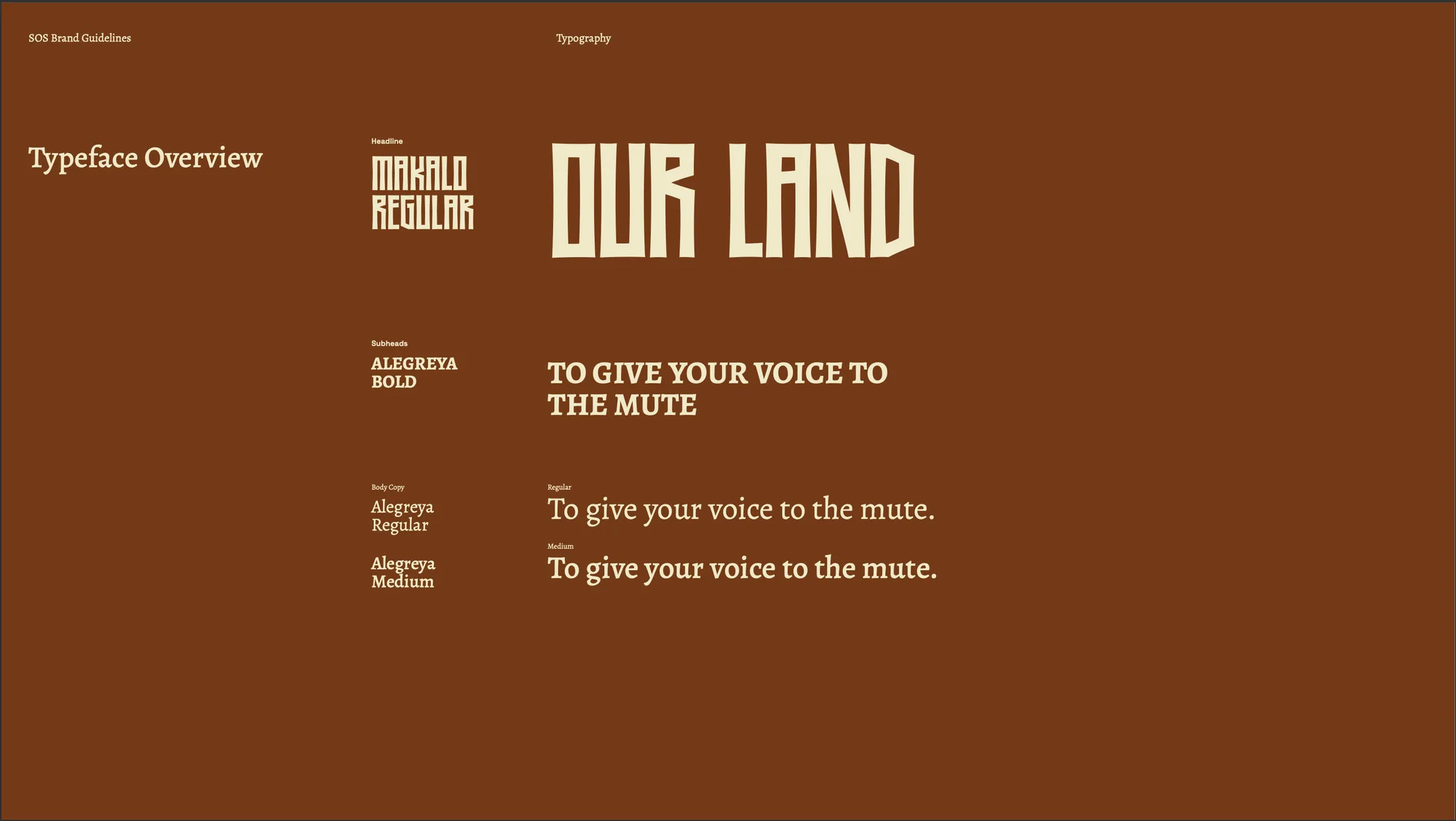
For the typeface, we thought we already had a good direction with Makalo, so we stuck with that for the header typeface. We also needed a body typeface that paired well with Makalo and fit with the brand. For that, we went with Alegreya, a humanist sans-serif typeface.
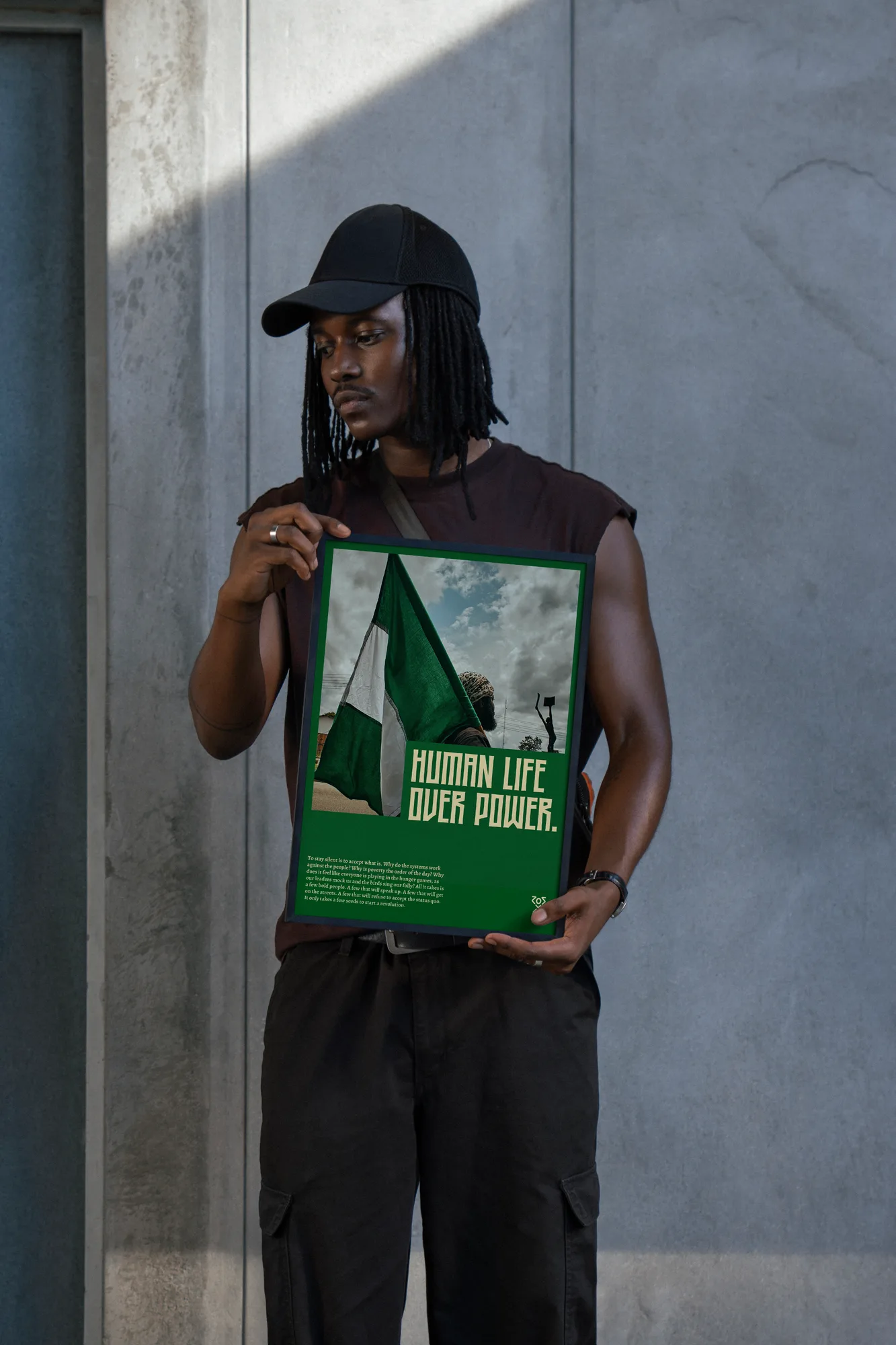
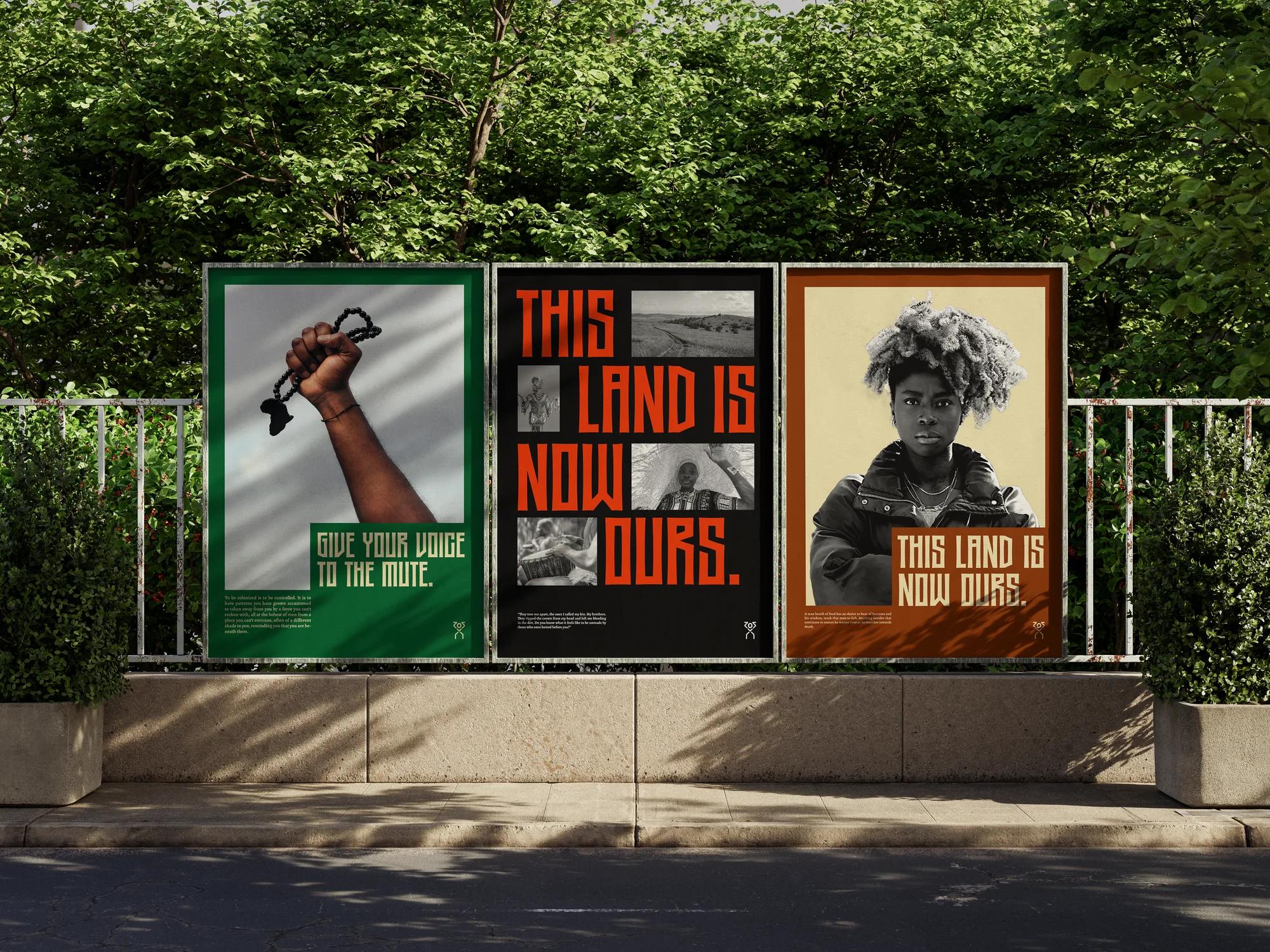
For our layout, we wanted something dynamic that could flex, but was also consistent enough that the SOS internal team could replicate without much difficulty. We built a grid system that allowed us to achieve just that
Color
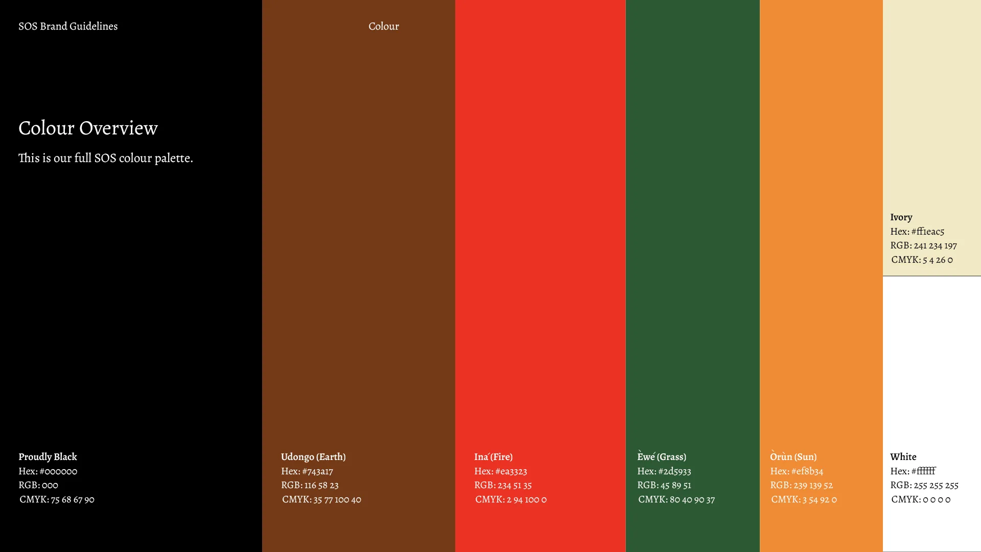
The color palette was inspired by nature with a mix of African culture. By using earth tones, greens and reds, we create a color system that tie into the overall brand identity, and is broad enough for visual exploration.
Brand Guidelines
Lastly, we designed a set of brand guidelines to help the SOS team to keep brand consistency, while allowing them room to flex and scale. Consistency, not conformity.